Charts From Data Pulled Out of Databases Start to Finish
Build clear Excel charts from database data: shape the query, pick the chart, keep ranges live, avoid misleading axes, add sparklines, export images.
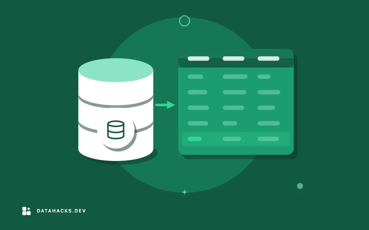
A table of 400 numbers is accurate and unread. A chart of the same numbers gets looked at for three seconds, and in those three seconds it either tells the truth or it does not. The data usually starts in a database, passes through a query and ends up in a workbook, and each step can help or hurt the picture: a query that returns months in alphabetical order, a missing month that makes a line jump, a bar chart whose axis starts at 9,000 so a 2% difference looks like a collapse. This guide takes a chart from the query to the finished sheet. It covers shaping the data, choosing the type, building the chart from code, keeping it correct as the data changes, avoiding the common distortions and delivering it as a native chart or as an image. The spokes linked throughout go into each step. If you want the quickest way to add a single chart to a generated workbook, sending charts from a query to an Excel sheet is the short version.
Start with the question
A chart answers one question, and the question picks the chart. Write it as a sentence before opening any tool.
"How has monthly revenue changed over the last 24 months?" is a trend, so a line chart. "Which five regions earn the most?" is a comparison of categories, so a sorted bar chart. "What share of orders comes from each channel?" is parts of a whole, so a stacked bar or, with few categories, a pie. "Do bigger orders take longer to ship?" is a relationship between two measures, so a scatter plot. "What are the exact figures for each region?" is not a chart question, and a table is the right answer.
Charts that try to answer two questions at once confuse both. A line with twelve series is a plate of spaghetti; a chart with two vertical axes invites the reader to find a connection that the scales manufactured. If you have two questions, draw two charts. The next spoke goes through the choice in detail: choosing Excel chart types for query results.
Shape the data in the query
Let the database do the work that databases do well: filtering, aggregating, sorting and filling gaps. The query should return a table that a chart can read without further work. For a line chart, one row per period and one column per series. For a bar chart, one row per category and one column of values, already sorted.
SELECT date_trunc('month', ordered_at)::date AS month,
       sum(total) FILTER (WHERE channel = 'web')   AS web,
       sum(total) FILTER (WHERE channel = 'store') AS store
FROM orders
WHERE ordered_at >= date_trunc('month', now()) - interval '24 months'
  AND ordered_at <  date_trunc('month', now())
GROUP BY 1
ORDER BY 1;
Several details in that query are there for the chart's sake. The window ends at the start of the current month, so a partial month does not appear as a collapse at the right edge of the line. Each series is its own column, which is the layout charts expect (a "wide" table); a long table with a channel column would need pivoting first. The result is ordered by month, so the line runs left to right.
Charts also need a complete axis. If no orders were placed in one month for one channel, GROUP BY returns no row, and a chart draws a line from the month before to the month after as though nothing happened. Fill the gaps from a calendar:
SELECT m.month,
       coalesce(sum(o.total) FILTER (WHERE o.channel = 'web'), 0) AS web
FROM generate_series(date '2024-11-01', date '2026-09-01', interval '1 month') AS m(month)
LEFT JOIN orders o ON date_trunc('month', o.ordered_at) = m.month
GROUP BY m.month
ORDER BY m.month;
generate_series produces every month in the window, and the left join keeps months with no orders. Whether a missing month should draw as zero or as a gap depends on the meaning: zero sales is zero, and an unmeasured value is not zero. Use NULL for unknown and 0 for none, and know that Excel draws a NULL as a gap or connects across it depending on the chart setting for empty cells.
For "top N plus everything else", compute the grouping in SQL so the chart does not have forty one-pixel bars: rank the categories, keep the top five and sum the rest into "Other". The SQL is a window function and a CASE, and it is far easier to review than the equivalent spreadsheet formulas.
Get the data into the workbook
Read the result into a data frame and write it to a sheet, with real dates in the category column and numeric types in the series columns. A date stored as text breaks a date axis, and numbers stored as text do not plot. The details are the same as for any generated workbook (building Excel reports from SQL queries people trust). Keep the chart data on its own sheet, often named Data or ChartData, and put the charts on a presentation sheet that reads from it. That separation lets you replace the data without touching the layout, and it keeps the chart's source visible.
Build the chart from code
A native Excel chart is a set of references to ranges, plus formatting. Generating it with a library means computing those references from the size of the result.
n = len(df)
chart = wb.add_chart({"type": "line"})
for col, name in ((1, "Web"), (2, "Store")):
    chart.add_series({
        "name": ["Data", 0, col],
        "categories": ["Data", 1, 0, n, 0],
        "values": ["Data", 1, col, n, col],
    })
chart.set_x_axis({"date_axis": True, "num_format": "mmm yy"})
chart.set_y_axis({"name": "Revenue (USD)", "num_format": "#,##0"})
chart.set_title({"name": "Monthly revenue by channel"})
ws_present.insert_chart("B2", chart, {"x_scale": 1.5, "y_scale": 1.2})
The last row is n, derived from the result, so a result with 25 rows draws 25 points without a code change. The date axis spaces points by time, which is correct when months are missing or uneven. Names point at header cells, so renaming a column renames the series. The XlsxWriter documentation is the reference for chart methods, and openpyxl offers the same for workbooks it builds.
When people add rows to the data sheet by hand, a fixed range stops short. Basing the series on an Excel table or a named range that grows with the data keeps the chart current (refreshing charts from a changing data range in Excel covers the options and the failure modes).
Axes, scales and honest pictures
Most misleading charts are accurate. The numbers are right, and the way they are drawn tells a story the numbers do not support. A handful of rules prevent it.
Bars start at zero. The length of a bar encodes the value, so a bar chart whose axis starts at 9,000 makes a 9,200 bar look twice the height of a 9,100 bar. Lines are different: they encode position and slope, and a non-zero baseline is often right for a line, as long as the axis is labeled and the scale is not exaggerated to make noise look like movement.
One axis per chart where you can. A second vertical axis lets you plot revenue and temperature on the same picture, and lets the author choose scales that make them correlate. If two measures must share a chart, index both to 100 at a start date, so the reader compares change.
Label the units and the period. "Revenue" is not enough; "Revenue, USD thousands, monthly" is. Put the unit on the axis title or in the chart title.
Keep the scale consistent across a series of charts. Five regional charts with five different y axes make small regions look as large as big ones. Use the same scale for charts that are meant to be compared.
Do not cut off or truncate the data silently. If the chart shows the last 24 months, say so. If outliers are clipped, say that too.
Order categories deliberately. Sort bars by value, unless the categories have a natural order such as months or age bands.
The spoke avoiding misleading axes in Excel charts goes through each, with the settings in Excel and in the libraries.
Small charts inside cells
Not every comparison needs a full chart. Sparklines are tiny charts that fit in a single cell, one per row, and they show the shape of a trend next to its number. Conditional formatting with color scales and data bars gives a similar quick read for a column of values. Together they let a table of 40 rows be scanned in seconds: the number for precision, the sparkline for the trend, the data bar for the magnitude. They are written from code with XlsxWriter's add_sparkline and the conditional format methods (sparklines and conditional formatting for quick scans). Use them when a reader has many rows to compare, and a chart when there are few series and a message to deliver.
Dashboards in a workbook
A dashboard is several charts and a few headline numbers on one sheet, arranged so a reader gets the state of things at a glance. In Excel, the workable recipe is modest: one data sheet per query, refreshed by a job; one presentation sheet with four to six charts and a row of tiles (the key figures, each a cell with a large font linked to the data sheet); a README sheet with definitions and the refresh time. Slicers and pivot charts add interactivity for readers who want to filter, and they require pivot tables, which carry their own cache of data inside the file.
The layout rules are short. Put the most important number top left. Use the same width for charts that sit in a column, and align edges. Show the as-of date prominently. Avoid decoration: borders, shadows and background images use ink and attention. And check that the numbers on the dashboard tie to the source, with a control total next to each tile (building dashboards in Excel from SQL output walks through the build).
If the dashboard needs to be live for many people, an Excel file passed around by email is the wrong container; a BI tool or a web page reading from the database serves better.
Getting the chart out of Excel
Charts often end up in a slide, a PDF or an email, not in a workbook. Two routes exist. Render the chart in Excel and export it, which needs Excel installed, so it suits a desktop workflow but not a server. Or draw the chart with a plotting library from the same data frame, producing a PNG or SVG with no Excel involved. The second is the dependable route for scheduled jobs, and the chart then lives in two places, a native version in the workbook for people who explore and an image for people who read (exporting Excel charts as images from a script or server compares the approaches).
An image is a snapshot. Put the date and the source in the caption, and generate it in the same job as the data, so the picture and the table cannot disagree.
Check the picture against the data
A chart is not trustworthy until someone has checked it. Four checks catch nearly everything. Compare the last value on the chart with the last row of the table. Compare a total on the sheet with a total from the database. Confirm that the category count equals the number of rows. Look at the chart with the axis scale visible and ask whether the story it tells is the story the data supports.
Automate what you can. A test that reloads the workbook and asserts that the chart's series ranges match the data size catches the stale-range bug. A test that compares the sum of the plotted column with a control query catches a filter mistake. Add the human look for the first build and any time the layout changes (testing a generated Excel report).
Accessibility and print
Charts reach readers who are color blind, who print in black and white, who use screen readers or who see the chart on a phone. Choose colors that differ in lightness as well as hue, and avoid red and green as the only distinction. Direct labels on lines and bars beat a legend that makes the reader look back and forth. Add alt text to charts (XlsxWriter supports description in insert_chart options) so a screen reader announces what the chart shows. Check the print layout: charts that cut across page breaks are a common annoyance, and fit-to-width settings fix most of it.
Performance with big data
A native chart with 100,000 points is slow to draw and impossible to read. Aggregate before charting: daily data for a two-year window is 730 points, which is plenty; hourly for a year is 8,760, which is too many for a line. Downsample in SQL with date_trunc and avg, min and max per bucket if the extremes matter. For scatter plots of very large data, sample rows or bin into a heat map. If you need to explore the full data, a tool built for it will do better than a spreadsheet.
Reuse across reports
Charts that appear every month deserve a small library of functions: line_chart(ws, data_ref, title, unit), bar_chart(...), with defaults for colors, fonts, sizes and axis formats. The reports then look alike, new reports take minutes and a style change happens in one place. Keep the colors in one palette module, assign a color to each category once (the same region has the same color in every chart) and keep the palette readable for color-blind users.
A worked example: from a revenue question to a finished sheet
A regional director asks, "Are we losing the store channel?" That is a question about change over time between two channels, so the first draft is a line chart with two series. Before building it, ask what "losing" means. A falling absolute figure? A falling share of the total? A decline against last year? Each answer needs a different table. For the share, the query returns each channel's revenue divided by the month's total; for the year-over-year view, the query returns the same month a year earlier beside the current one.
Suppose the director means share. The query computes store / (web + store) per month, and the chart shows one line that moves between 38 and 31 percent over 24 months. A single line with a clear title ("Store share of revenue, monthly") says more than two revenue lines that both grow, because it removes the growth that was never the question. The axis is labeled in percent, starts at zero because the reader will compare it against 50 percent in their head, and carries a light horizontal line at the average.
Then the pushback arrives: the dip in December looks alarming. The answer is in the data, not the chart. December store revenue is always lower in the share because web sales spike for gifts. A second line for the same months a year earlier, in a lighter color, shows the seasonal pattern and makes the point without a paragraph of explanation. This is the pattern for most "is this bad?" questions: put the comparison on the chart.
The finished sheet has the chart at the top, the table of 24 rows underneath, a one-line note on how share is defined and the as-of date. The query is in version control, the job runs on the second of the month and a check compares the last chart point with the last table row. The director gets the same layout every month and learns to read it. That consistency is worth more than any single clever design.
Mistakes that come from the data, not the chart
Many bad charts are bad because of what went into them. A few causes recur.
Partial periods. The current month is half over, and its bar is half the height of the others. Exclude it, or mark it clearly as month to date and project nothing.
Mixed grain. Daily rows for the last month and monthly rows before it, plotted on one axis, make a spike. Aggregate to one grain.
Currency and unit mix. Revenue in two currencies summed as if they were one. Convert first, in the query, and label the result.
Double counting. A join that fans out rows inflates a total, and the chart faithfully draws the inflated line (designing a report query before touching Excel explains fan-out).
Survivor bias. A chart of average customer value that includes only customers still active. State the population.
Time zones. Evening orders landing in the wrong day or month, which moves bars between neighbors. Decide the zone and apply it in SQL.
Averages of averages. The average of regional averages is not the overall average unless every region has the same volume. Compute the overall figure from the underlying rows.
The remedy for all of them is the same check: reproduce one number on the chart from a separate, simple query. If the two disagree, the chart is not ready.
Color, labels and annotation
Color does more work in a chart than people expect, and it is easy to waste. Use one strong color for the series that matters and neutral gray for context. Use a categorical palette only when categories must be told apart, and keep it to six or fewer colors. Assign each category the same color across every chart in a report, so a reader who learned that blue is the north region does not have to relearn it on page three.
Label directly where you can. A line labeled at its right end with the series name beats a legend, because the reader does not look away from the data. Data labels on every point of a long series are clutter; label the first, the last and the extremes. Annotations explain events: a note on the chart marking the month a price changed, or a campaign started, turns a mysterious step into an explanation. In native Excel charts, annotations are text boxes or an extra series with one labeled point; XlsxWriter supports custom data labels for that purpose.
Titles should say what the chart shows, not what it is. "Store share of revenue fell from 38% to 31% in 24 months" tells the reader what to see. "Store share" does not. Use a statement title when the chart exists to make a point, and a descriptive title when it is a reference.
Time series specifics
Time series are the most common chart from databases and the most error prone. A few practices make them reliable.
Aggregate to a grain that matches the decision: weekly for operations, monthly for finance, quarterly for strategy. Smooth noisy series with a rolling average computed in SQL (avg(x) OVER (ORDER BY month ROWS BETWEEN 2 PRECEDING AND CURRENT ROW)) and show the raw series faintly beside it, so the reader sees that the smoothing is a choice. For seasonal data, compare to the same period last year rather than to the previous period. Use a date axis, not a text axis, so uneven gaps are spaced truthfully. Mark forecasts differently from actuals, with a dashed line and a label, and never extend a solid line into the future.
Indexing helps when series have different scales. Setting each series to 100 at the first period lets the reader compare growth rates directly, and it removes the need for a second axis. State the base period in the title.
A review checklist before a chart ships
Before a chart leaves your hands, go through a short list. Does it answer one question, stated in the title? Does the table behind it reproduce a number you trust? Do the axes carry units, and do bars start at zero? Is the period complete, and is the as-of date visible? Are colors consistent with the other charts in the report, and legible without color? Can a reader tell what each series is without hunting? Is the range tied to the data size? Would a stranger read the same message you intended? If any answer is no, fix it before the chart is sent. Charts that skip this review are the ones that get quoted in a meeting and corrected a week later.
When an Excel chart is not the right tool
An Excel chart is the wrong tool when the audience is large and the data is live, since a dashboard or BI report serves everyone from one source. It is wrong when the data has many thousands of points or needs interaction beyond filtering. It is wrong when the figure must meet a publication style, where a vector graphic from a plotting library gives control that Excel does not. And it is wrong when the number of exact values matters more than the shape: then a table, perhaps with a few conditional formats, is the better answer.
Where to go next
Start with choosing Excel chart types for query results and avoiding misleading axes in Excel charts, because the choices there matter more than the tooling. Then read refreshing charts from a changing data range in Excel so the charts stay correct, and sparklines and conditional formatting for quick scans for in-table visuals. For assembling the pieces, read building dashboards in Excel from SQL output, and for delivery outside Excel, exporting Excel charts as images from a script or server. The openpyxl chart documentation covers the other library, and the PostgreSQL manual on set-returning functions explains generate_series, used above to fill gaps. The site's tools convert small samples between CSV and JSON in your browser.